
Share |
Art : “Japanese Touch” at Mohonk Arts
By Hanna M. Sawka, M.F.A.
ART TIMES online June 2011
It is not an earth-shattering discovery to say that art is perhaps the most universal human form of expression, an international language that crosses boundaries. This same form of expression tends to also distill and represent its native culture in a deep, yet understandable form – in short, we can glimpse the workings of the soul of a distant civilization and understand it, even if its social mores and language are beyond our ken. As much as its technological gadgets, cars and sushi have penetrated our American world, Japan is a vastly different culture, perhaps almost an opposite “pole” in the way human societies are organized. In Japan, deep and formal traditions continue to dictate day-to-day interactions, including special words used with people of different ages and standings. This is nothing like our American directness and informality. On the other hand, during a visit to Tokyo in the late 1990’s, I felt that the youth culture there made New York look rather tame. I have never again seen such a display of near-theatrical fashions, carefree openness in expressing various sexual orientations, and tribes of rebellious youth. This was some terrific flamboyance, along with a cosmopolitan and realistic approach to sex, a big step away (and forward) from our uniquely American conflict with sexuality. Yet, cultures and people that are worlds apart can interact with perfect ease within the scope of art, making everyone involved all the richer and inspired for it.
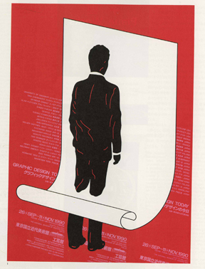 "Graphic Design Today" "Graphic Design Today" poster by Shigeo Fukuda |
I was in Tokyo thanks to my father’s art. My father, artist Jan Sawka, had won a grant from the Japanese Ministry of Culture and I had the luck to accompany him for a few weeks of his three-month long stint. For an art-loving soul, this time was pure heaven, as we were in contact nearly every day with some of the finest people in the arts. At times we required a translator’s help, or we depended on a lot of gestures to help with broken English and Japanese, but the sharing of art brought an immediate understanding. Some of these artists had become friends of my father’s since the outset of his career in the 1970’s. During that decade, my father was already a strong presence in the European art scene. He was a member of the now historic “Polish School of the Poster.” He was one of the youngest fine artists to win the “Oscar de la Peinture” in the Painting Competition at Cagnes-Sur-Mer, France, the town made famous by the father of modern painting, Paul Cezanne. Yet, the first major article to be written about his work appeared in Japan’s “Idea Magazine.” This was the first of many in-depth writings on my father’s work by Japanese artists and writers. It was an illustrated, 11-page piece written by Shigeo Fukuda, who himself would soon be the first Japanese artist to be inducted into the American branch of the Art Director’s Hall of Fame. Mr. Fukuda, who passed away a few years ago, was a master of an illusionist graphic design style. He created modern, bold images with strong environmental and peace messages. His work was in no way limited to the poster. To this day, his playful public sculptures enliven areas of Tokyo and other cities. Mr. Fukuda would go on to write more about my father and vice-versa, but first, they met at the American Bicentennial Celebrations in Aspen, CO in 1976. Mr. Fukuda represented Japan at this celebration that brought together all sorts of dynamic people, including Gloria Steinem, writer Tom Wolfe, architect and designer Mario Bellini and many others. In a strange twist of fate, my father was there as a representative artist for France, specifically, the Pompidou Center in Paris, where he had been a resident artist of just two weeks. Two weeks earlier, my father and his family (meaning my mother and my baby-self) were exiled from Poland in response to my father’s political, counter-cultural art. Little did our family know that we would eventually, thanks to some more twists of fate, come to the U.S.A. to reside permanently within just a couple of years. In the meantime, my father enjoyed a meeting with a kindred soul from a distant culture.
Poland and Japan are very different cultures, yet from the outset of his career, my father found that Japanese artists and critics understood him perfectly. The opposite situation would prove to be true, as well. There was more than synergy behind this understanding. One thing both countries had in common was that they produced some of the best poster design during the 1960’s and 70’s, which was the golden era for the poster. During those two decades, the art of the poster reached a peak in terms of its political and artistic meaning. Poster Biennials were major events and the winners were also the designers behind everything from the look of publications to famous logos that we know to this day. The poster was one of the powerful forms of expression of counter-cultural movements. During the 60’s and 70’s, posters with politically charged images graced the rooms of rebellious students all over the world. To this day, my father gets permission requests from Hollywood productions that use his posters to dress movie sets that are designed to reflect that era. The careers of major art dealers such as Larry Gagosian and Leo Castelli began from poster-dealing.
Emerging as a major industrial player, Japan made its impact on the world stage with a variety of outstanding forms of design that helped to establish its products in new markets all over the world. Back then, Japanese products were only just emerging and they initially had little respect. Beautiful and unique packaging and design was a key element in establishing the position of Japan’s products in the United States and other parts of the world. The poster was just one of an entire design movement that made its first impression with the revolutionary design of the 1964 Tokyo Olympics by Yusaku Kamekura. Designers had an incredibly important role in a country that was emerging from the devastation of the Second World War. They were responsible for the impression products made, for the perception of the words “Made in Japan.” To this day, designers are important leaders in society. They continue to be responsible for their country’s reputation. Designers also are recognized for the impact they make on daily life, because design is the application of beauty, form and function to the things that are part of our lives and that surround us. How lucky the Japanese that commute in trains designed by Kenji Ekuan, a trained Buddhist priest who believes that creating beautiful and functional forms is an ethical responsibility to the human beings that will be impacted by the designs with which they come in contact. Masuteru Aoba, another outstanding designer, was put in charge of the aesthetics of Tokyo, one of the largest and densest cities in the world that, if not kept tightly in check, could easily become a filthy, claustrophobia-inducing concrete jungle.
In Poland, the poster took on significance for completely different reasons. Poland was under a totalitarian government, with vigilant censorship. Artists, who would otherwise have focused their energies on painting or print-making, were limited to using their talents for poster-design. This accomplished a number of things for the system, the first being that any design could not go to print without being approved by the Censorship Bureau. Another form of control was that artists had few other venues through which they could make a living. The poster also received such support thanks to the fact that it was one of only two art forms encouraged by Vladimir I. Lenin himself (the other being film), for the simple reason that these two art forms were (and are) powerful propaganda tools. This set of circumstances created a group of outstanding poster designers now known as the “Polish School of the Poster.” My father is a member of this group, which is why his “Exodus” poster was one of around twenty selected for an exhibition on the School at the Museum of Modern Art in New York in 2009.
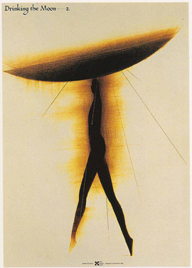 Offset print of "Drinking the Moon," Offset print of "Drinking the Moon," by Koichi Sato |
During the Cultural Ministry grant trip and others, my father was in continual contact with some of the great artist-designers of Japan, including Kazumasa Nagai, Tadanori Yokoo, Koichi Sato, Ikko Tanaka and others. I knew that some of these gentlemen were living members of world art and design history and it was a very special opportunity to see their studios. As an admirer of the books of the flamboyant Yukio Mishima, who infamously committed suicide in 1970 during a failed coup d’etat, I was fascinated to meet Tadanori Yokoo and Koichi Sato. Both artists came from Mishima’s unusual inner-circle and they could not be more different. Mr. Yokoo, who creates surreal images that, at times, appear to be pop-art versions of the Kama Sutra, is also a remarkable “performer” in daily life, an extrovert with a delightful sense of the absurd. On the other hand, Mr. Sato is an introverted gentleman who says little, but then strikes us with delicate and extremely refined images that play with light and shadow.
During my own few weeks in Tokyo, I was honored (and very lucky!) when the great Yusaku Kamekura, who single-handedly established Japan’s design position in the world with his design of the graphics for the 1964 Olympics in Tokyo, personally made itinerary recommendations for my tour of the capital’s art and cultural scene. He sent me off on this magical tour with Akiko Sanada, a young woman who worked in art-book publishing by day and played in a punk band by night. While I had experienced Western cultural capitals before, such as London and my native New York, Tokyo was something else; a crossroads of cultures from everywhere, starting with the powerhouse of Asian countries, to Latin America, and the Western World. I was able to experience an astounding variety of music, performing arts and visual arts. Some of it was completely new to me. Soon after, I returned home and started my first year at Smith College. Inspired by the journey to Japan and the work of Kiyoshi Awazu, I directed and designed a thesis project theatrical spectacle in my senior year, an adaptation of Japanese Romeo and Juliet, “The Love Suicide at Amijima.”
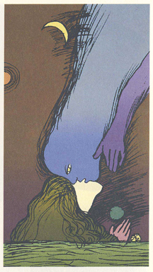 "The Dream.", silkscreen "The Dream.", silkscreen by Kiyoshi Awazu |
Afterwards, I went abroad for a Masters program in film directing at the Polish National Film School. In 1997 my father organized a retrospective of Kiyoshi Awazu at the National Museums of Poland, which toured four major museums throughout the country. This was a remarkable show that encompassed painting, print-making, poster and book design and installations. Awazu was the creator of beautiful and colorful public artworks throughout Japan that included a skyscraper in Tokyo that was painted in striking graphics. He also created experimental installations that used projections in a way that was decades ahead of its time for World Expo pavilions. He was closely tied to avant-garde theater, poetry and film. He created graphic elements for historic films such as “Double Suicide” and “Kaidan.” He was involved with one of the most important avant-garde theaters of the tumultuous 1960’s – Tenjo Sajiki. I was lucky to be able to personally witness Mr. Awazu communicating with Polish viewers, not only though his rich, varied and avant-garde art, but with calligraphic demonstrations, in his refined artistic hand, of the very roots of the oldest written words. That same year, another exhibition was conceived in Poland. It was called “Sawka-Sat” and it took place at the “Galeria Centrum” in Katowice, Poland in 1997, later touring other museums and galleries. My father and Koichi Sato created visual bases for one another (“Questions”), on which each artist improvised his own “Answer.” The result of these questions and answers were works that combined the two artists’ creativity and styles. Koichi Sato uses airbrush techniques to create fluid, light-filled spaces, while my father’s hand is of a more concrete nature, with strong lines. The different techniques and uses of color created fantastic, hybrid works.
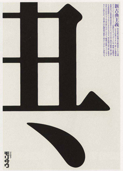 Poster made for Ryumin, a type-face company, by Ikko Tanaka |
Throughout the years, a stunning set of books in my parents’ home comprised both a delight and a great lesson about Japanese culture. These books are a series of books on Japanese aesthetic sensibilities that were designed and overseen by Ikko Tanaka. One book explains the aesthetic concepts of “Wabi, Sabi and Suki” through Mr. Tanaka’s selections of photographs, which visually translate these potentially elusive ideas to anyone non-Japanese. A supreme master of color, he also created several books on Japanese color. Ikko Tanaka, who passed away in 2002, was a towering authority in design, art and architecture. He created some of the most graceful posters ever made in design history. He was the director of Gallery Ma, a showcase for new architecture. He also infused brilliant color into and designed for the famous fashion studios of Issey Miyake and Hanae Mori.
A person who made a profound impression on me was Kazumasa Nagai, a man of great elegance that, instead of being icy, is infused with warmth and great modesty. Kazumasa Nagai is to this day a moral leader in Japanese design. For years, he directed the Nippon Design Center. His own, very personal creations include refined graphics about the environment. Delicately crafted from paper in beautiful and complementary tones, an unforgettable series shows animals of all types with striking, almost human eyes. Next to the creatures are the words, “Save me. I am here.” Such thoughts and emotions regarding the environment are conjured by an entirely different art-form and artist of a younger generation, sculptor Teruo Fuchigami. Mr. Fuchigami creates large sculptures from wood that seem to come straight from nature. Mr. Fuchigami’s environmental stance is no pose. He lives in the Japanese wilderness and is morally opposed to killing a tree for his art. He searches out naturally fallen trees for his works. While he is primarily a sculptor, his presentations of his sculptural works on paper are elegant graphic artworks in and of themselves.
To this day, every year, my father receives remarkable New Year’s greetings from Kenji Ekuan. Anyone who has gone to an Asian restaurant and has used soy sauce has touched his most ubiquitous piece of industrial design, the Kikkoman sauce bottle. He has also designed bullet trains, motorbikes and other everyday objects. This great industrial designer is a trained Buddhist priest who practices and writes about the importance of philosophy and ethics in art and design. His New Year’s greetings are graphically brilliant and also deeply spiritual statements, important thoughts for the coming year. This past year, his greeting showed a cascade of light, like a sun-shower. The words read, “Light comes from the East, the place of disaster.” (The place of disaster being the Tsunami-stricken region).
Last year, our family was greatly saddened by news of the passing of Masuteru Aoba. This man was a great artist and an incredible character. I recall him as a tough-looking type, who could have easily walked out of a gangster movie. This was the right personality to enforce aesthetics and visual discipline on Tokyo, one of the densest megalopoli in the world. On the other hand, Mr. Aoba was a warm and caring person, which was reflected in his mentorship for young talents. Together with my father, he was one of the master artists assigned to emerging artists through the Guardian Garden program and gallery. My father continues to serve as the “Godzilla” for this organization. Mr. Aoba created playful public sculptures, as well as amazing prints and paintings, many of which served as the foundations for posters concerning serious issues. For many years, generations of young Japanese artists will carry his memory in their hearts.
My father’s Japanese grant in 1994 that had brought me along to Tokyo led to many collaborations and further artistic exchanges for my father. A few years before, Tadashi Suzuki, the most prominent auteur of Japanese avant-garde theater, had produced a multi-media spectacle of my father’s called “The Eyes.” “The Eyes” used physical artworks, but also large, high resolution projections of delicately animated artworks. People not only from Japanese artistic circles had seen “The Eyes,” but so had scientists and engineers working in cutting-edge technologies. My father’s Cultural Ministry grant allowed him to deepen these relationships and collaborations that led to his creation of artworks combining his art and newly developing light, projection and glass and screen technologies.
Together with developers from tech firms such as NSG, the developer of “Smart Glass” and TOHO Studio (the film and media studio where Akira Kurosawa did most of his work), my father created the first “UMU” sculptures. UMU glass is a new type of plasma-glass that switches from opaque to transparent within the split-second of an electric charge activating or deactivating the plasma. The sculptures also use a cutting edge magic called “liquid light,” which utilizes ionic charges to change the color of illuminated particles before one’s very eyes, giving the impression of colorful and fluid light in motion. The first UMU sculptures were created for a Sumitomo-sponsored architectural proposal of my father’s for the Royal Family of the United Arab Emirates, the “Tower of Light.” The small, UMU version of this design stands at Sumitomo headquarters in Singapore to this day. Two others were made later for the Lisbon World Exposition of the Sea. Four more UMU sculptures have been made to date.
Artists who mutually admire their work also like to make exchanges of their artworks. This is how, during this journey and many others, my father developed quite a magnificent collection of his Japanese colleagues’ works. For years, it has been a sort of hidden gem here in the Hudson Valley. For the first time, he would like to share these works with the Hudson Valley public. An exhibition of artworks by Ikko Tanaka, Kiyoshi Awazu, Shigeo Fukuda, Kazumasa Nagai, Masuteru Aoba, Tadanorii Yokoo, Kenji Ekuan, Teruo Fuchigami and Koichi Sato is at the Daniela Passal Gallery at Mohonk Arts in High Falls, NY. The works will be accompanied by personal commentaries by Jan Sawka. What is more, the UMU sculptures that he designed and created in Japan will lend their magical atmosphere to this special show that is a result of friendships and collaborations spanning oceans and cultures.
(Hanna M. Sawka, M.F.A., lives in High Falls, NY)