
|
|

By RAYMOND J. STEINER
BIRGE HARRISON (1854-1929), teacher of landscape painting and driving force behind the Art Students League of New York opening its summer sessions in Woodstock, New York in 1906, was wont to tell his students that color was not only seen, but also heard. An advocate of plein air painting — he touted the League’s Woodstock facility as “the best landscape school in the world” — Harrison argued that color “waves” at the higher and lower ends which were not visible to the human eye were nevertheless received into human consciousness through the ears and that landscape painters who confined their activities to working in the studio were thus rendering themselves insensible to the totality of nature. Like many of the old-school Hudson River painters, he believed that a landscape painter’s full range of sensibilities ought to come into play — that in order for a landscape painting to achieve verisimilitude, one has not only to see, but also to feel, smell, hear, and taste the scene through total on-site immersion. To my eyes, Linda Richichi’s current exhibit* at the RiverWinds Gallery in Beacon, New York, would have mightily pleased
|
|
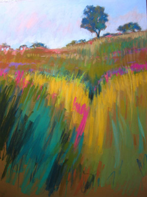
Birge Harrison. Some thirty paintings — mostly pastels, but also
a few oils and one oil and mixed media (“Subsiding Storm”) comprise the
major part of the show — with a wide variety of cards and prints
also on hand for viewing. If land- and seascapes predominate, I do not
hesitate to suggest that the real subject that runs throughout the exhibition,
as the title of the show suggests, is color, pure and simple. Or, perhaps
I ought not so glibly say “pure and simple” since — as Harrison
tried so hard to get his students to comprehend — it appears that
Richichi has allowed herself to “open” more fully to its impact than many
might dare. Her “vocabulary” or color runs the gamut from muted understatement
(“Impending Storm”) and serenity (“Hudson River View North”) to overflowing
color-pots (“Pastoral Morn”) and unleashed exuberance (“Yellow and Pink”)
— with a good many pauses in-between. Perhaps her painting, “Playing
with Colors”, says it all, as three encaustics included in the exhibit
so eminently exemplify — unlike her usual work, these three (“Yellow
Cloud”, “Magenta Cloud”, and “Blue Cloud” are non-representational abstractions, color alone “carrying” the burden of the message. Birge Harrison
might say that not only can you see and hear Richichi’s colors —
her fields of purple loosestrife, for example, nearly shout aloud —
but very nearly taste them,
as well. Sure — there is respect for nature here if not, in fact,
reverence for the divinity behind nature. An eye for gentle slope, imposing
mountain-face, for flower-filled meadows, and quiet lakes, for soft dawns
and cloud-filled skies, all are grist for Richichi’s roving eye for the
perfect viewpoint — but over it all is that sense of burgeoning
color, of color bursting from its limitation of forms, of overflowing
the frame and nearly running off the canvas into the viewer’s eyes. And
this is true for either her large-scale works (e.g. the majestic
“Pink Mist over Hudson” or little vignettes (“Study of Ulster Hay View”,
my favorite). I particularly like her use of the elongated (some call
them landscape-sized) canvases in either the horizontal or vertical (“Blue
Above”) positions. If her use of gentle line reveals the love Linda Richichi
has for communing with the gods of flora and fauna, it is above all her
succumbing to the seduction of color that reveals her unmitigated joy
in reveling in the out-of-doors with paintbox and canvas — a joy
that visitors may readily share by dropping in at RiverWinds before the
show closes.
*Linda Richichi: “Colors
of the Hudson Valley” (thru Jun 5): RiverWinds Gallery, 172 Main St.,
Beacon, NY (845) 838-2880